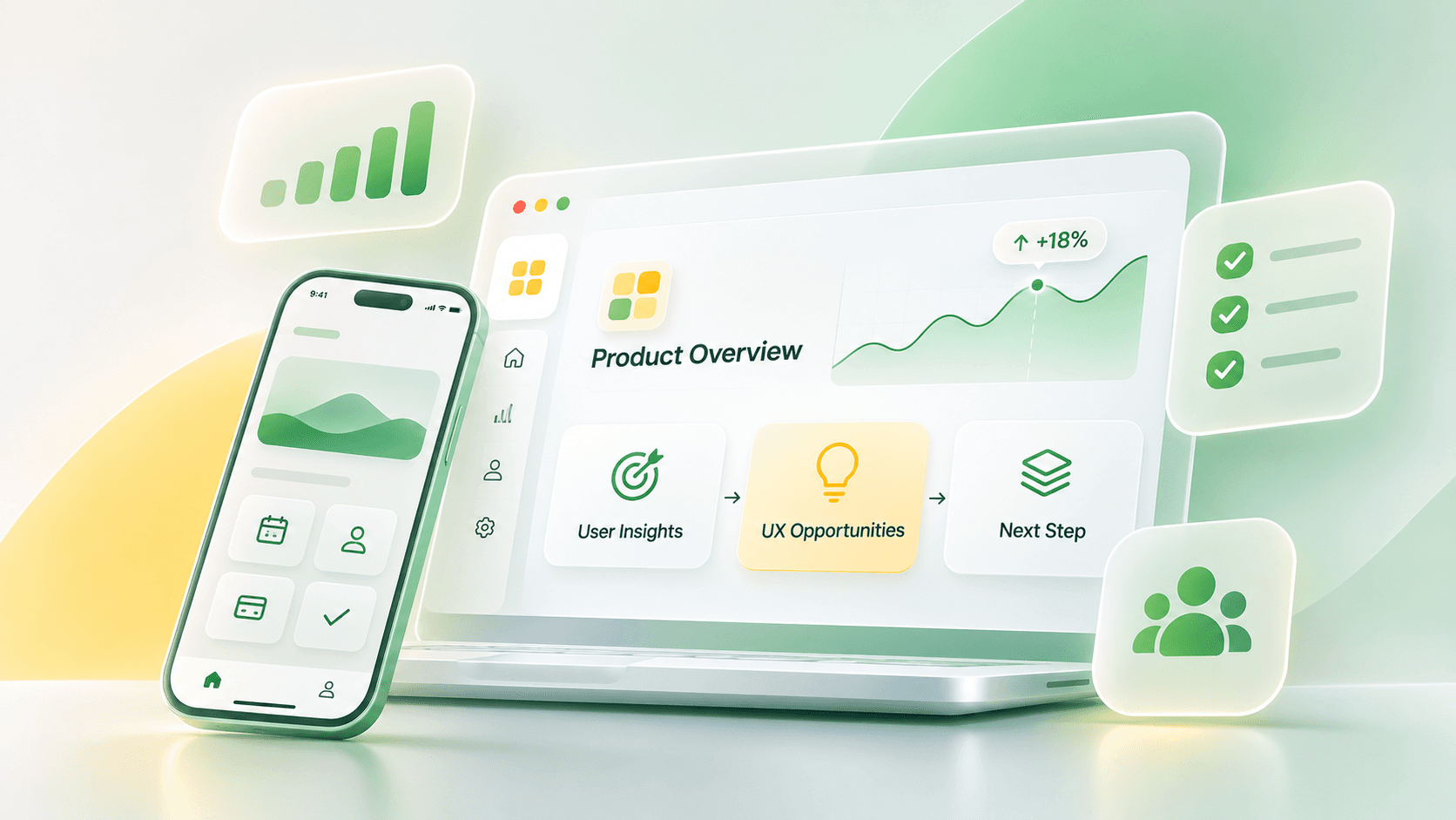
Launching a mobile app is an important milestone, but some of the most valuable product decisions happen after people start using it.
Features that seemed essential during development may receive less attention than expected. Users might take paths the team never anticipated, or turn to customer support for tasks that appeared straightforward in testing.
These observations don’t necessarily mean something is wrong with the product. They reveal how the app fits into people’s actual needs, routines, and expectations.
The challenge is deciding what to do with that knowledge.
Should you simplify a particular interaction, reconsider a critical user journey, invest in research, or redesign a larger part of the experience?
Not every opportunity calls for a redesign. A small improvement to an important task may create more value than rebuilding several screens. At other times, the product has evolved enough that isolated fixes are no longer sufficient.
The goal is to make the next product decision based on evidence rather than assumptions.
Of all the improvements your team could make, which ones are genuinely worth investing in?
When Real User Behavior Challenges Your Assumptions
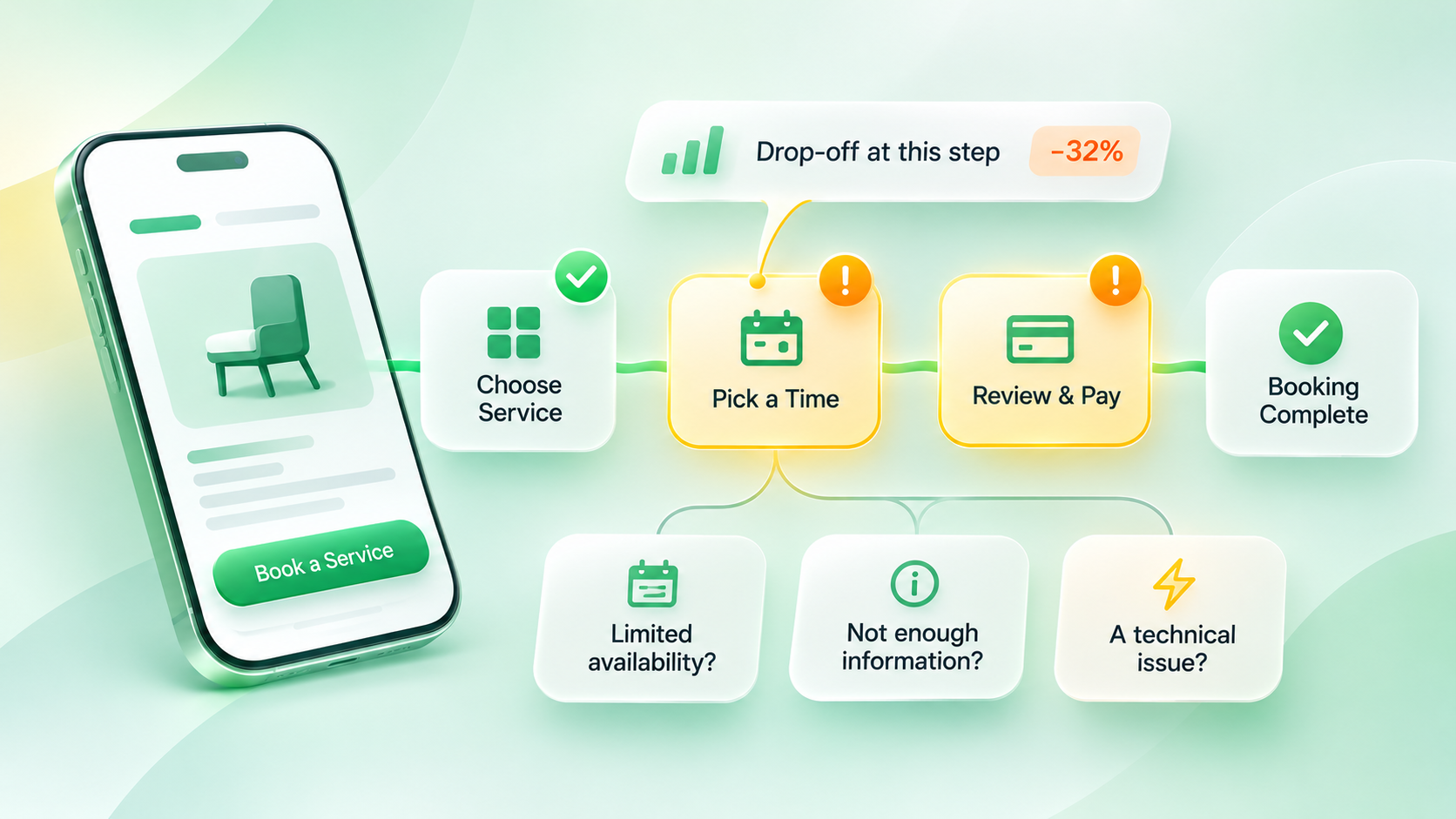
Imagine a mobile app that allows people to book appointments for different services.
The journey appears straightforward: choose a service, select an available time, review the details, and confirm the booking.
The product team has designed and tested the experience before launch.
A few weeks later, analytics reveal that many users reach the time-selection screen, but some leave before completing their bookings.
The first suggestion in a product meeting might be to simplify the screen. Someone else may propose redesigning the entire booking flow.
But the team is missing a crucial piece of information: why are people leaving?
Perhaps the available appointments don’t fit their schedules. Maybe the final price appears too late, the cancellation policy isn’t clear, or a technical error prevents bookings from being confirmed.
Each possibility requires a different response.
If users can’t find suitable times, changing the interface won’t solve the availability problem. If they’re uncertain about cancellation terms, clearer information may be enough. If the booking request fails because of a server error, the technical issue needs attention first.
This hypothetical example illustrates an important distinction:
Observed behavior tells you where to investigate. It doesn’t always tell you what’s causing the problem.
That distinction should guide how teams approach UX improvements.
Look Beyond App Usage to Understand User Value
Downloads, active users, session duration, and engagement trends are useful indicators. However, they don’t necessarily tell you whether users are accomplishing what they came to do.
In a booking app, completing an appointment may matter more than opening the home screen several times.
In an education app, account creation is only the beginning. Finding a relevant course, completing an initial lesson, and returning to continue learning may better reflect the user’s progress.
For a financial product, creating an account and successfully completing a first transaction represent different stages of the experience.
This connects to user activation: the point at which users take a meaningful action that helps them experience the product’s core value.
There is no universal activation event for every app. Teams need to identify meaningful actions based on their users’ goals and the product’s purpose.
Segment users before making product-wide decisions
Suppose a new app release is followed by a drop in booking completion.
Before changing the interface, ask a few questions.
Is the decline affecting everyone, or primarily new users? Are Android and iOS users experiencing the same issue? Did it begin immediately after the latest release?
Imagine the data shows that booking completion has declined primarily among users running a particular Android version.
Further investigation reveals an increase in errors during booking confirmation on that version.
In this scenario, a booking-flow redesign would be a poor starting point. The team should investigate the technical failure first.
This is why aggregate metrics can hide important differences.
Segmenting users by behavior, app version, device, or stage of the journey can reveal patterns that a single average might overlook.
Of course, segmentation is only useful when the underlying data is reliable and the groups are large enough to interpret responsibly.
Correlation isn’t the same as causation
Another common mistake is treating a relationship between two metrics as proof that one causes the other.
Suppose users who save items to their favorites are also more likely to return to the app.
Does that mean making the favorites feature more prominent will automatically improve retention?
Not necessarily.
People who already find the app valuable might be more likely both to save items and to return. The feature and retention are correlated, but the causal relationship remains uncertain.
Before investing in a redesign around that assumption, teams could examine relevant user segments, conduct interviews, or evaluate the proposed change through a controlled experiment when feasible.
This doesn’t mean every small improvement requires extensive research.
It means knowing which conclusions are supported by evidence and which are still hypotheses.
Find UX Opportunities Within Real User Journeys
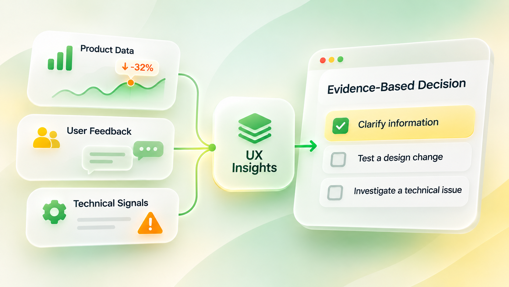
Once the team has a clearer view of how people use the product, the next step is identifying meaningful opportunities for improvement.
A useful approach is to start with the tasks that bring people to the app.
What are users trying to achieve? Which steps matter most? Where does the experience support their goals, and where does it introduce unnecessary effort?
Three types of evidence are especially useful.
Behavioral data shows which paths people take, what actions they complete, and where journeys are interrupted.
User feedback and observation help uncover expectations, misunderstandings, and frustrations that quantitative data alone may not explain.
Technical and operational evidence reveals crashes, network failures, support patterns, and business-process constraints that can affect the experience.
Consider users who repeatedly navigate back to an earlier screen.
They may be comparing information before making a decision. Alternatively, they may be unable to find their way through the interface.
The observed behavior looks similar, but the solutions could be entirely different.
In the first case, an improved comparison experience might help. In the second, navigation or contextual guidance may need attention.
Combining different forms of evidence helps the team move beyond vague suggestions such as “the screen needs to feel more modern.”
Instead, the problem becomes specific enough to investigate, discuss, and eventually solve.
Match the Strength of Your Evidence to the Risk of Your Decision
Not all UX decisions carry the same level of risk.
Rewording a button is different from reorganizing the app’s primary navigation. Redesigning several essential journeys could affect established user habits, development costs, and existing product behavior.
A useful principle is to match the strength of the evidence to the potential consequences of the change.
For a small, reversible improvement, reviewing feedback and testing a limited solution may be sufficient.
For a major redesign, teams should consider a wider evidence base: behavioral analysis, user research, technical constraints, and testing of proposed changes.
This approach is consistent with the idea of using multiple research methods to build confidence in important UX decisions.
The goal isn’t to slow product development with unnecessary research.
It’s to avoid making expensive decisions on weak assumptions.
A good product decision doesn’t always require more data. It requires enough reliable evidence for the decision being made.
Targeted Improvements, UX Evaluation, or Redesign?
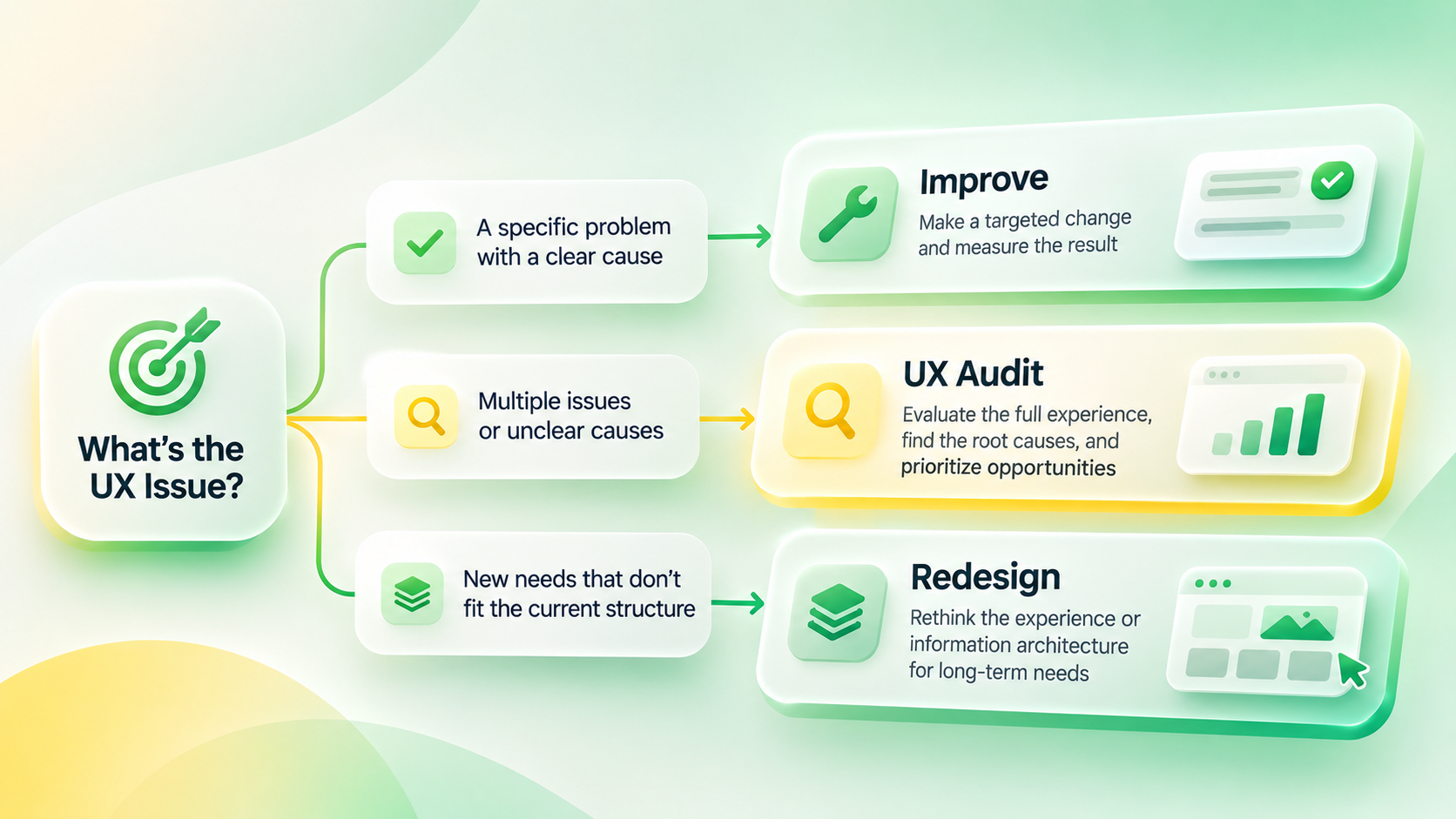
Once you understand the problem, you can begin choosing the appropriate intervention.
Sometimes the cause is clear and the solution can be tested within a single interaction. Sometimes the team sees friction across several journeys but cannot identify its source. In other situations, the product’s structure no longer supports its evolving requirements.
The following decision framework offers a starting point.
| What you’re observing | What to consider next |
|---|---|
| A specific task is difficult, and the cause is reasonably well understood | Make a targeted improvement and evaluate the result |
| Users experience friction across several important journeys, but the causes are unclear | Conduct a structured UX evaluation |
| New requirements no longer fit the current product structure | Explore a phased or broader redesign |
| Reliability or performance problems interrupt core tasks | Investigate and resolve technical issues |
| Users complete tasks but don’t experience the expected value | Revisit user needs and the product’s value proposition |
These are not mutually exclusive options. A product can have technical and usability issues at the same time.
The purpose is to clarify the problem before committing to a solution.
When a targeted improvement makes sense
Imagine users repeatedly returning to the transaction-details screen before confirming a payment.
Research suggests that they want to double-check the recipient and amount.
If that interpretation is supported, making the confirmation details more visible could be worth testing.
Redesigning the entire payment experience without additional evidence might introduce unnecessary cost and risk.
A focused change gives the team an opportunity to evaluate an improvement without disturbing unrelated parts of the journey.
When a broader UX evaluation is valuable
Sometimes friction isn’t confined to one screen.
Users struggle to discover features, interaction patterns differ across sections, or completing a single task requires unnecessary movement between different parts of the app.
In these situations, isolated screen-level improvements may not address the underlying issue.
A UX audit can help teams examine critical user journeys, information architecture, interactions, and available product evidence as a connected system.
The outcome doesn’t have to be a recommendation for a complete redesign.
An audit may show that much of the existing experience works well, while only a few journeys need focused attention.
If you’d like to understand how this process works, what it evaluates, and how findings are prioritized, explore our guide to UX audits.
When a broader redesign deserves consideration
Consider an app originally designed around a single core task.
As the product grows, it introduces new services, user roles, and workflows. People now need to navigate between features that weren’t part of the original structure.
Eventually, the existing information architecture may struggle to represent how those capabilities relate.
If research confirms that the problem is structural, a broader redesign may be appropriate.
Even then, changing everything at once isn’t always necessary.
Teams can test new navigation models, preserve successful elements of the current experience, and introduce changes gradually.
A redesign becomes a stronger investment when the team can explain which problem it addresses, why smaller changes may be insufficient, and how success will be evaluated.
When a broader redesign is the right next step, our Mobile App Design service can help turn those insights into a more intuitive and cohesive mobile experience.
Turn UX Opportunities Into Product Priorities
Identifying opportunities is only part of the challenge. Product teams still need to decide what to tackle first.
Imagine three proposals competing for attention:
Improving a frequently used booking step, reorganizing navigation, and redesigning part of the home screen.
Customer support may prioritize the issue generating the most questions. Designers may see navigation consistency as the bigger concern. Business stakeholders may focus on increasing completion of a critical action.
Each perspective can be valuable.
The next step is connecting those perspectives to evidence.
Four questions can help structure the discussion.
User importance: How strongly does the issue affect a task users care about?
Reach: Which users are affected, and under what conditions?
Confidence: Do we understand the likely cause, or are we still working with an assumption?
Effort and risk: What dependencies, costs, and potential consequences come with the proposed change?
These factors don’t have to become a numerical score, especially when reliable inputs are missing.
Sometimes the discussion reveals that a small improvement is ready to implement, while a larger issue still requires investigation.
That distinction matters.
A problem can be a high priority even when its proposed solution isn’t ready to build.
For some important problems, the next action should be research rather than design.
Five Questions to Ask Before Planning Your App’s Next Step
If you’re responsible for improving an existing mobile app, the following questions can help turn broad ambitions into a more focused product discussion.
| Question | What your team should clarify |
|---|---|
| 1. Which user experience are we trying to improve? | A specific user goal and the journey supporting it |
| 2. What evidence suggests a change is needed? | Behavioral data, feedback, observation, or technical signals |
| 3. What other explanations could exist? | Potential UX, technical, operational, or product-value issues |
| 4. How risky is the proposed change? | Scope, cost, dependencies, reversibility, and affected users |
| 5. What’s the smallest useful next step? | A targeted fix, experiment, research activity, audit, or redesign |
Let’s return to the booking app.
The team might discover that a booking issue is specific to one Android release. Alternatively, it might find that cancellation terms need to be clearer or that users struggle across several connected booking stages.
Each finding leads to a different next step.
The benefit of this framework is that it changes the conversation from “How do we make the app better?” to “What should we investigate or improve first, and why?”
Once an action has been chosen, the team can also agree on ownership, success measures, and when to review the result.
Make Your Next Product Decision With Confidence
Improving a mobile app doesn’t always mean adding features or changing its appearance.
Sometimes progress means preserving something that works, simplifying a critical journey, or adapting the product structure to evolving user needs.
What connects these decisions is an understanding of the current experience and the problem worth solving.
At youx Studio, our UX Audit service helps product teams evaluate existing experiences, identify friction, and prioritize opportunities for meaningful improvements.
If you’re planning the next stage of your mobile app, you don’t need to decide on the scope of a redesign before understanding the problem.
Start with an important user journey, examine the evidence you already have, and identify what you still need to learn.
That can be the foundation for a more focused improvement plan and a productive conversation about your product’s next stage.