Money changes how people experience digital products.
A confusing navigation pattern in a social app may be frustrating. A slow screen in an entertainment product may be annoying. But when the same friction appears while someone is checking their balance, sending money, verifying their identity, or making an investment, the experience becomes much more serious.
Users are not simply interacting with an interface. They are making decisions about something valuable.
That is what makes fintech app UX design different from ordinary product design. Financial products have to make complex systems feel simple without making them feel mysterious. Users should not need to understand payment networks, ledger architecture, authentication systems, or regulatory requirements to use a banking app. At the same time, the interface cannot hide information that users need to make confident decisions.
The real challenge is therefore not removing complexity.
It is translating complexity into clarity.
Behind a seemingly simple banking screen there may be KYC and AML processes, core banking APIs, payment processors, transaction states, fraud systems, double-entry ledgers, reconciliation processes, and regulatory constraints. Every one of these systems can influence what the user sees, when they see it, and what happens after they tap a button.
Good fintech UX sits at the intersection of these two worlds: the complexity of the financial system and the simplicity users expect from modern digital products.
The strongest banking experiences do not pretend that the underlying system is simple. They make its complexity understandable, predictable, and trustworthy.
Why trust is the foundation of fintech UX
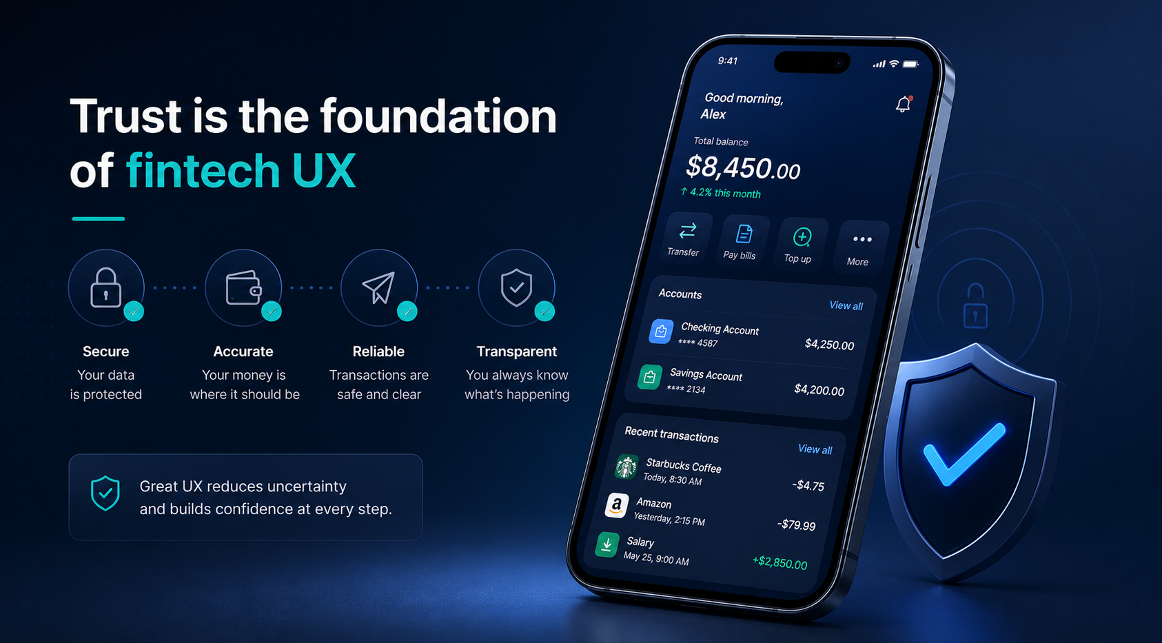
Trust is always important in digital products, but financial products operate at a different level.
When someone opens a banking application, they are not simply consuming information. They are checking whether their money is where it should be, deciding whether a payment is safe, transferring funds, investing savings, or sharing highly sensitive personal information.
Every interaction therefore answers an implicit question:
“Can I trust what this product is telling me?”
A poorly designed interface can make users question even when the underlying system is working correctly. A delayed balance update may look like missing money. An unclear payment status can make users wonder whether a transaction happened twice. A generic error message can leave them unsure whether to retry, wait, or contact support.
These moments create more than UX friction. They create anxiety.
For fintech companies, that anxiety can have measurable business consequences. Complicated onboarding can increase abandonment. Unclear transaction flows can increase support requests. Poor information architecture can reduce engagement with financial features. And a lack of transparency can weaken long-term customer confidence.
Good banking app design therefore needs to accomplish two things at the same time:
Reduce unnecessary cognitive effort while increasing confidence in important financial decisions.
That requires a deeper understanding of the product than simply designing screens. Designers need to understand what happens behind those screens—and what the system can actually guarantee.
Trust Starts Before the First Transaction
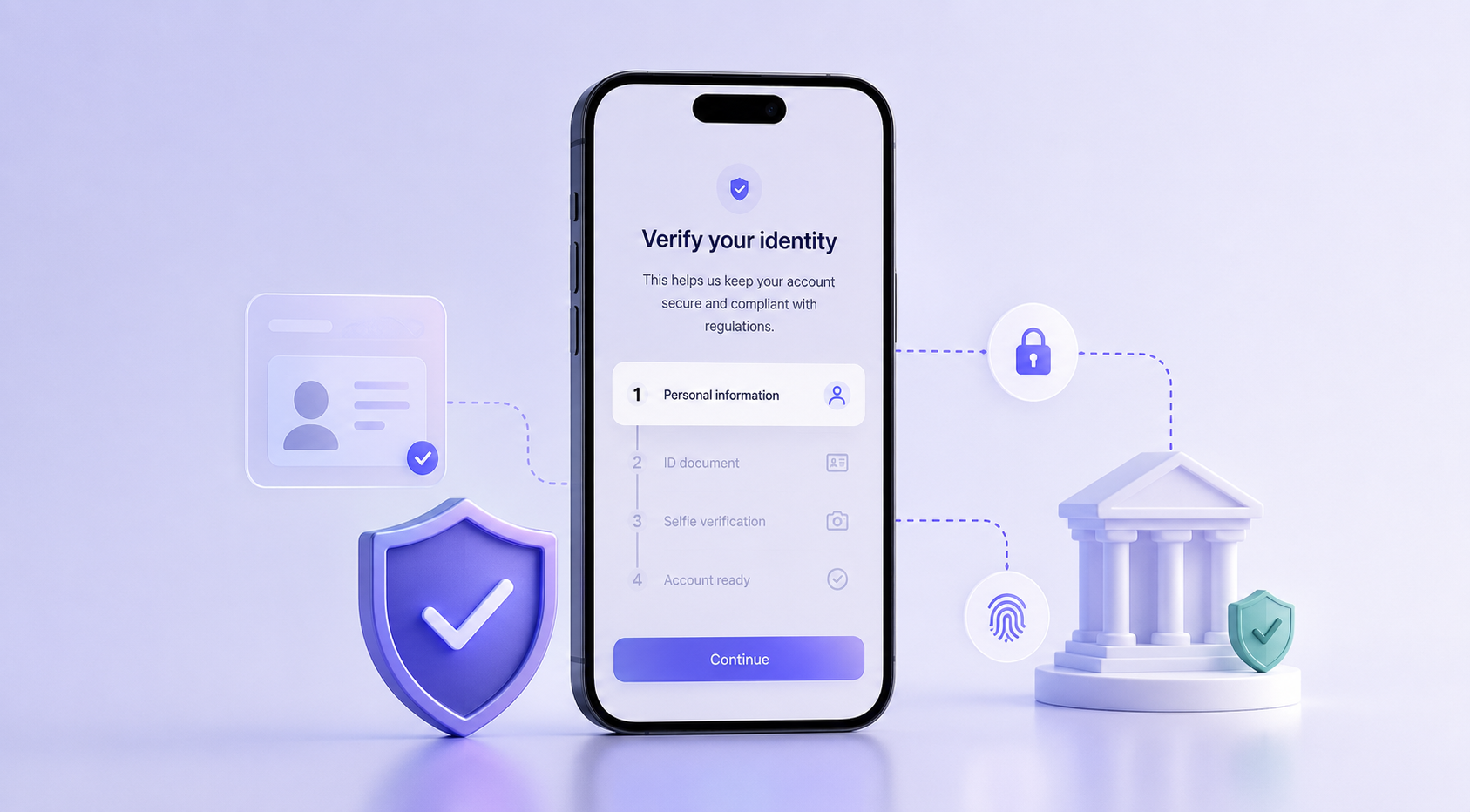
Trust in a financial product does not begin when money moves. It begins much earlier.
For a new customer, the first serious interaction may be identity verification. The product might ask for a phone number, legal name, identification document, address, date of birth, or biometric information before the user can access a financial service.
From the company’s perspective, these requirements may be necessary for KYC, AML, fraud prevention, or regulatory compliance. From the user’s perspective, however, they are sensitive questions being asked by a product they have only just started using.
This creates a fundamental tension in fintech onboarding UX.
The goal should not simply be to remove steps. Some steps cannot and should not be removed. The goal is to make users understand why those steps exist and introduce them at the right moment.
A long form that asks for everything upfront can make the product feel bureaucratic before the user has even experienced its value. Progressive disclosure provides another approach: collect information when it becomes relevant, explain why it is needed, and avoid asking users to make decisions they do not yet understand.
Context makes a significant difference.
Compare asking for an identity document with no explanation to explaining that verification is required before the user can activate transfers. The underlying requirement has not changed, but the user’s understanding has.
Good financial UX does not hide compliance. It makes compliance understandable.
The same principle applies to security.
Modern authentication methods such as biometrics, passkeys, device authentication, and risk-based verification can make secure interactions feel almost invisible. A user checking their balance and a user authorizing a large transfer should not necessarily experience the same level of friction.
This leads to an important principle for secure UX for mobile banking:
Friction should reflect risk.
Low-risk actions can remain lightweight. High-risk actions deserve stronger authentication, clearer confirmation, and more opportunities for verification.
When security appears at the right moment and for the right reason, it creates confidence rather than frustration.
Make Money Understandable
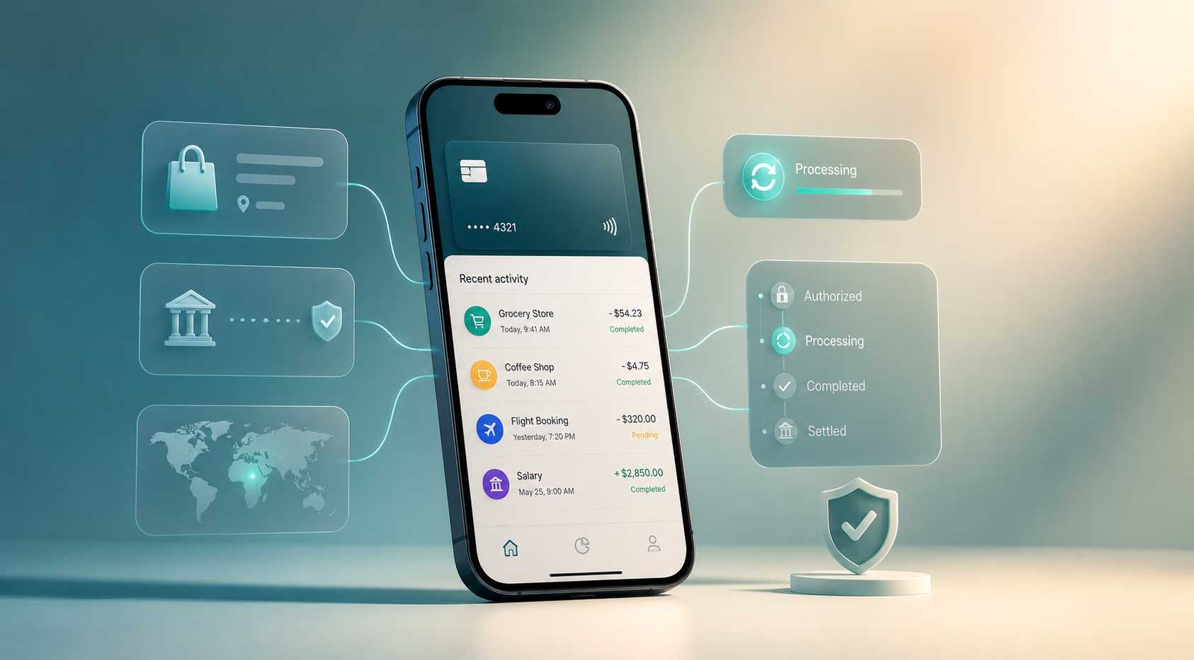
Once users enter the product, the next challenge is helping them understand what is happening to their money.
Financial systems naturally produce technical information. Transaction references, authorization codes, settlement states, merchant identifiers, timestamps, processor responses, and account numbers may all be meaningful to the systems involved.
They are not necessarily meaningful to the person using the app.
A customer does not want to interpret TXN_99482_LA. They want to know where the money went.
This is where banking app design becomes more than arranging information on a screen. The interface has to transform raw financial data into a mental model that makes sense to a human.
A transaction should answer basic questions quickly:
What happened? Where did the money go? How much was it? When did it happen? What is its current status?
That might mean showing a recognizable merchant or recipient name, the amount, date and time, category, payment method, and relevant location or reference information.
The underlying data may still be messy. The UX should not be.
But transaction clarity becomes even more important when something is not final.
A financial transaction rarely exists in only two states: successful or failed. Depending on the payment system, there may be authorization, pending, processing, completed, declined, reversed, expired, or partially failed states.
Users do not necessarily need to understand the infrastructure behind those states. They do need to understand what each state means for their money.
Imagine making a card payment and seeing only:
Pending
That single word leaves several questions unanswered.
Was I charged? Should I pay again? Has the merchant received the money? Will the amount change?
A better interface could explain that the payment is still being processed and that the amount may change once the transaction is completed.
The specific behavior depends on the financial system, but the UX principle is consistent:
When the state of the money is uncertain, the interface should reduce uncertainty.
This is also why confirmation screens matter.
Before a high-value transfer, the user should be able to quickly verify who will receive the money, how much is being transferred, which account it comes from, when it is expected to arrive, and whether fees apply.
The purpose of confirmation is not to make the user think more.
It is to make sure they think about the things that matter.
Design for What the System Is Actually Doing
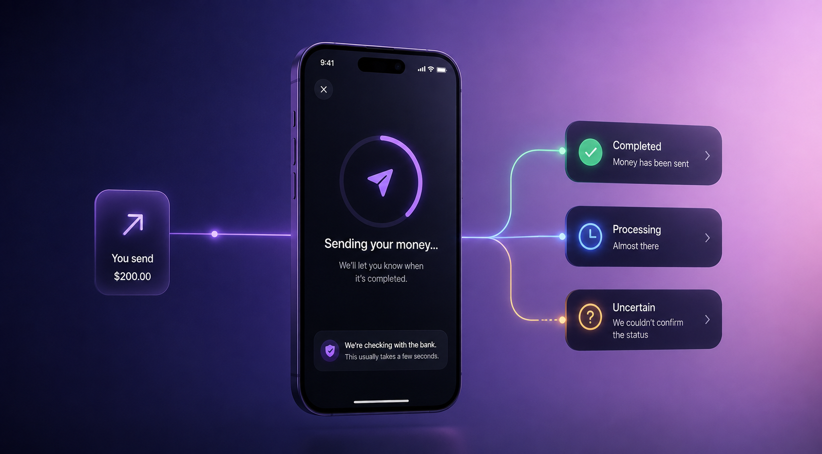
One of the biggest differences between fintech UX and ordinary product design appears when the interface meets the underlying architecture.
A designer may see a balance.
An engineer may see a ledger, payment processor, core banking API, event stream, settlement process, and reconciliation workflow.
The user sees one number.
That number has to make sense.
Consider a simple example. A customer has $1,000 available and makes a $200 card payment. Depending on the architecture, the available balance might immediately become $800 while the settled or ledger balance remains $1,000 until the transaction is finalized.
Technically, both values can be correct.
From the user’s perspective, however, two different numbers can look like a bug.
This is where financial product UI/UX has to acknowledge backend reality rather than designing around an idealized system.
Showing an Available Balance and a Current/Ledger Balance can make the distinction explicit when it matters. The interface does not need to teach double-entry accounting. It simply needs to explain why the numbers differ.
The same principle applies to API latency.
Suppose a user initiates a transfer, but the banking API takes several seconds to return a final status. A design that jumps immediately from “Send” to “Success” may look perfect in Figma but become misleading in production.
The real product needs to account for the uncomfortable middle:
The user has taken an action, but the system does not yet know the final outcome.
That might require a processing state, a delayed confirmation, a status check, or a notification when the transaction is finalized.
The same problem appears when a network connection disappears after a user submits a transfer.
If the application simply returns an error, the user may try again. But if the first request actually reached the bank, the second attempt could create a duplicate transaction.
A trustworthy experience needs to communicate what is known and what is not.
For example:
We lost connection while checking your transfer status. We haven’t confirmed whether the transaction was completed. Please don’t submit it again.
The exact wording and behavior will depend on the system architecture. But the design principle is broader:
Never leave users guessing about the state of a financial action.
This is why fintech UX cannot be treated as a visual layer added after engineering decisions have been made.
Designers need to understand the states the system can actually produce. Engineers need to understand what information the user needs to make sense of those states.
The best experiences emerge when those two perspectives meet early.
Turn Financial Data Into Decisions
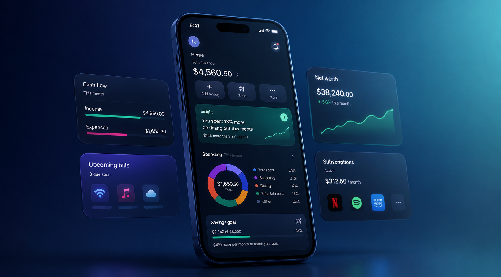
Financial products generate enormous amounts of information.
Transactions, balances, spending categories, subscriptions, savings, investments, credit information, and recurring payments can all become useful inputs for users.
But more data does not automatically create a better financial product.
A dashboard filled with charts can still leave a customer asking:
“What am I supposed to do with this?”
This is where modern neobank UX design patterns should move beyond simply displaying information.
A good financial interface helps users interpret their situation.
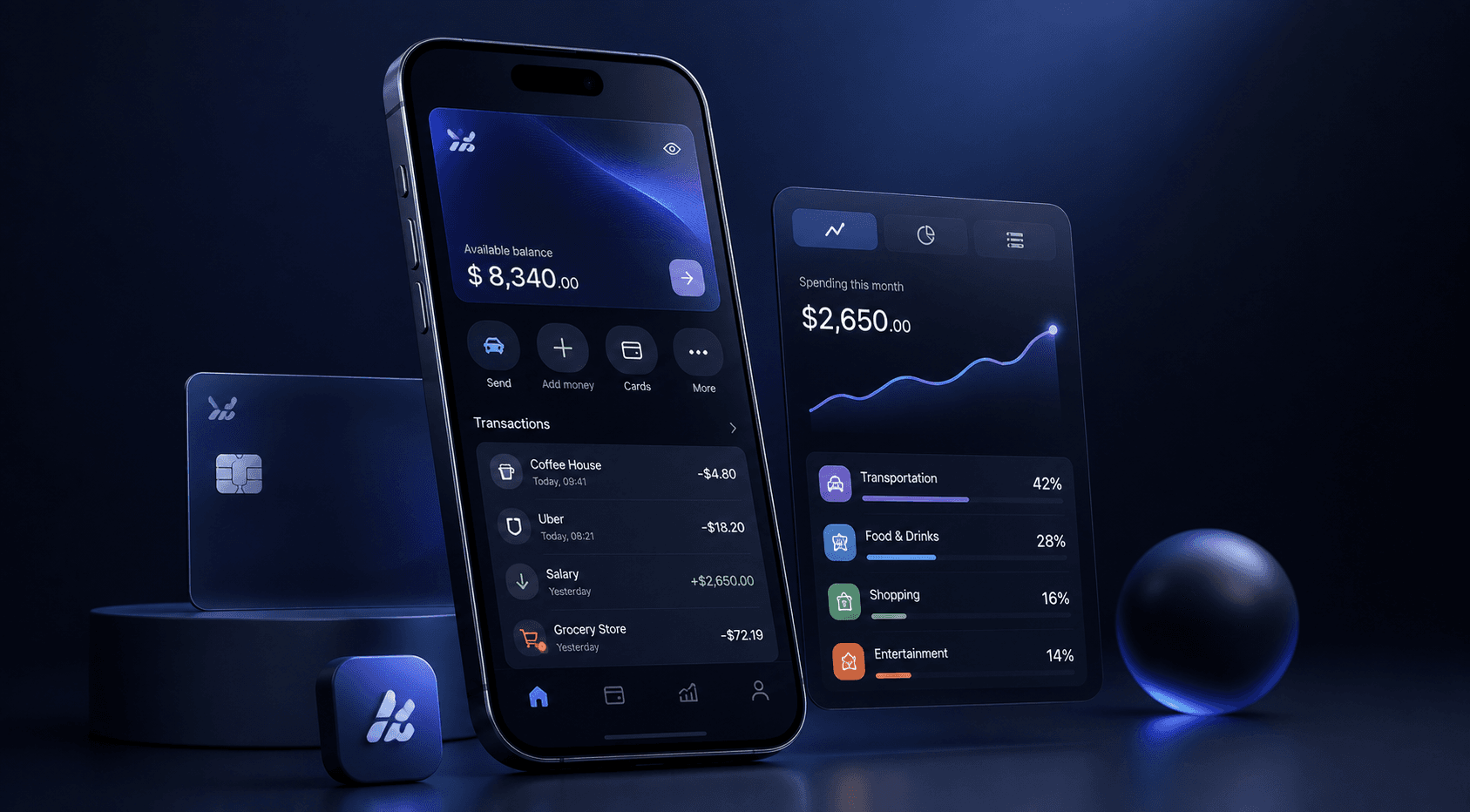
Instead of showing only that transportation represents 24% of monthly spending, the product might point out that transportation spending is significantly higher than the user’s recent average.
Instead of displaying a generic savings chart, it might show how much remains to reach a specific goal and what monthly contribution would be required to get there.
The difference is important.
One approach presents information.
The other helps the user make a decision.
This does not mean turning every banking application into an automated financial advisor. Personalization and insights need to remain transparent and appropriately contextual, especially when they influence financial decisions.
The interface should help users understand why something is being shown and, where appropriate, what they can do next.
Visualization also needs to reflect the reality of financial data.
A chart showing spending over time is only useful if users understand what the numbers represent. Pending transactions, refunds, transfers between accounts, investment values, and settled transactions may need different treatment.
Again, the visual layer depends on the underlying financial model.
The goal is not to make financial data look sophisticated.
The goal is to make it useful.
Design for Risk, Error, and Human Reality
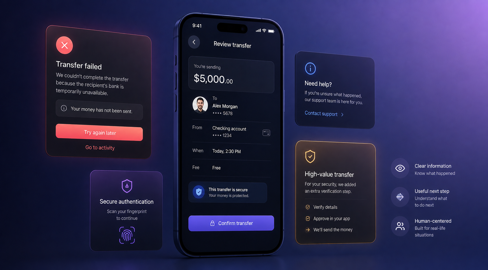
The strongest financial experiences are not defined only by their happy paths.
They are defined by what happens when something goes wrong.
In a social application, an error message may be an inconvenience. In a financial application, the same message can create immediate anxiety.
Imagine initiating a transfer and receiving:
Something went wrong.
The system may know exactly what happened.
The user does not.
Should they retry? Wait? Check their balance? Contact support? Was the money sent?
A useful error state answers three questions:
What happened? What does it mean? What should I do next?
For example:
We couldn’t complete the transfer because the recipient’s bank is temporarily unavailable. Your money has not been sent. Please try again later.
That message is longer, but it reduces uncertainty and gives the user a clear next step.
This matters across authentication, card payments, deposits, withdrawals, identity verification, and account management.
The same thinking applies to accessibility.
Accessibility in financial products is not simply about meeting a checklist. It can directly reduce the probability of costly mistakes.
Financial amounts need strong visual hierarchy. Critical information should not rely only on color. Touch targets need to be usable. Text needs sufficient contrast. Actions need clear labels.
Context is equally important.
There is a meaningful difference between displaying:
-$5,000
and:
Transfer $5,000 to Alex Morgan
The second provides the context required to verify the action.
This becomes especially important as transaction value and risk increase.
A $5 coffee and a $5,000 transfer should not necessarily require identical interaction patterns.
The right question is not:
How do we remove friction?
It is:
Where does friction protect the user, and where does it simply slow them down?
That distinction is central to good mobile banking UX.
Build a Financial Product That Can Scale
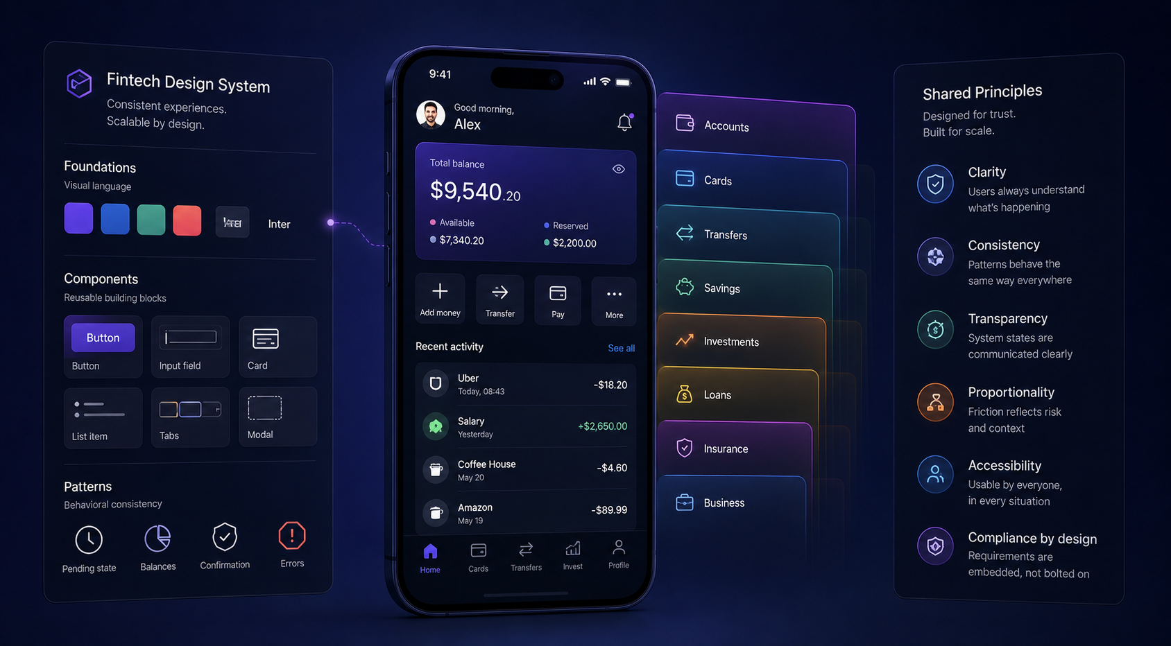
Fintech products rarely remain limited to their original feature set.
A first release might contain accounts, cards, transfers, and transaction history. Over time, the same product may expand into savings, investments, lending, insurance, rewards, international payments, or business banking.
As that happens, consistency becomes increasingly important.
A design system provides the foundation, but a mature fintech design system needs to go beyond colors, typography, and reusable components.
It should also define behavior.
How does the product represent a pending transaction?
How does it distinguish available money from settled money?
How are high-risk actions confirmed?
What happens when an API request times out?
How are reversed transactions presented?
How should financial amounts, fees, dates, and currencies be formatted?
These are not isolated UI decisions. They are recurring product patterns.
When these patterns are defined early, teams can build new features without reinventing fundamental interaction logic every time.
This is where the relationship between product design, engineering, compliance, and security becomes particularly important.
A design system can make a product visually consistent, but only shared product thinking can make it behaviorally consistent.
That distinction becomes increasingly valuable as the product grows.
What Great Fintech UX Actually Looks Like
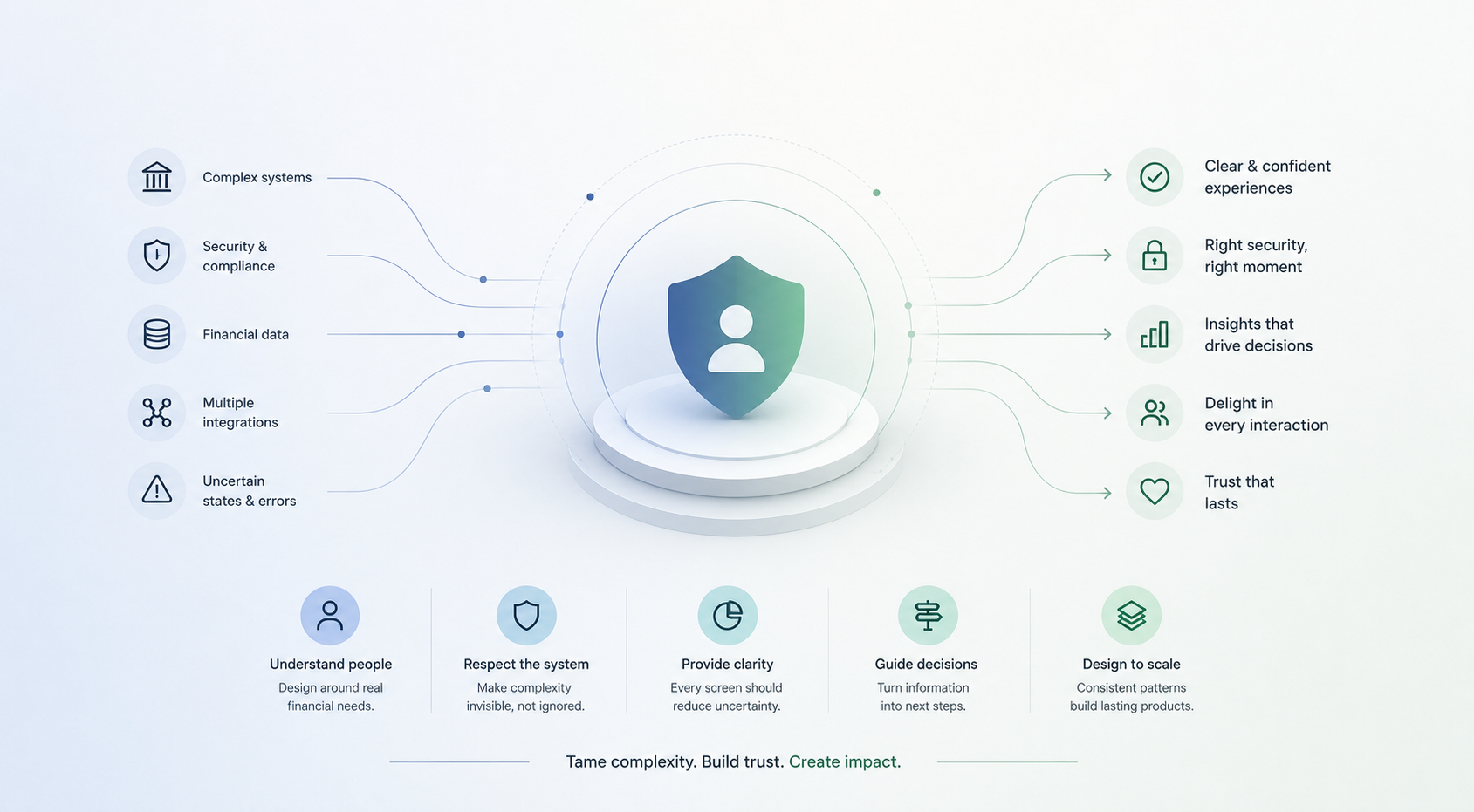
Great fintech UX does not mean making a banking application behave like a social network.
It means understanding which complexity belongs to the system and which complexity belongs to the user.
A customer should not need to understand banking infrastructure to use a banking product. But they should always have enough information to understand what is happening with their money.
That requires a combination of clear onboarding, proportional security, understandable transactions, meaningful financial data, transparent system states, useful error recovery, accessible interaction patterns, and a design system capable of scaling with the product.
More importantly, it requires designers to work with the financial system rather than designing around it.
When product designers understand the constraints of the ledger, APIs, payment networks, compliance requirements, and security model, they can make better UX decisions.
And when engineers understand the user’s mental model, they can expose system states in ways that are easier to understand.
The result is not simply a cleaner interface.
It is a product that feels predictable.
And predictability is one of the foundations of trust.
Final Takeaway
Fintech UX is ultimately about building a reliable relationship between people and financial systems.
The most successful products do not eliminate every form of friction. They distinguish between friction that protects the user and friction that simply gets in their way.
They make onboarding understandable without weakening compliance. They make transactions clear without exposing unnecessary technical complexity. They turn financial data into useful decisions. They acknowledge backend limitations instead of pretending they do not exist. And when something goes wrong, they give users enough information to understand what happened and what to do next.
For fintech founders, neobank teams, and financial product leaders, this means UX should not begin with screens.
It should begin with the user, the financial system, and the decisions that connect them.
That is the real opportunity in fintech product design: not to hide complexity, but to tame it.
If you are building a new fintech product, redesigning a banking experience, or simplifying a complex financial workflow, youx Studio can help connect product strategy, UX design, and technical realities to create financial products that people can understand and trust.